
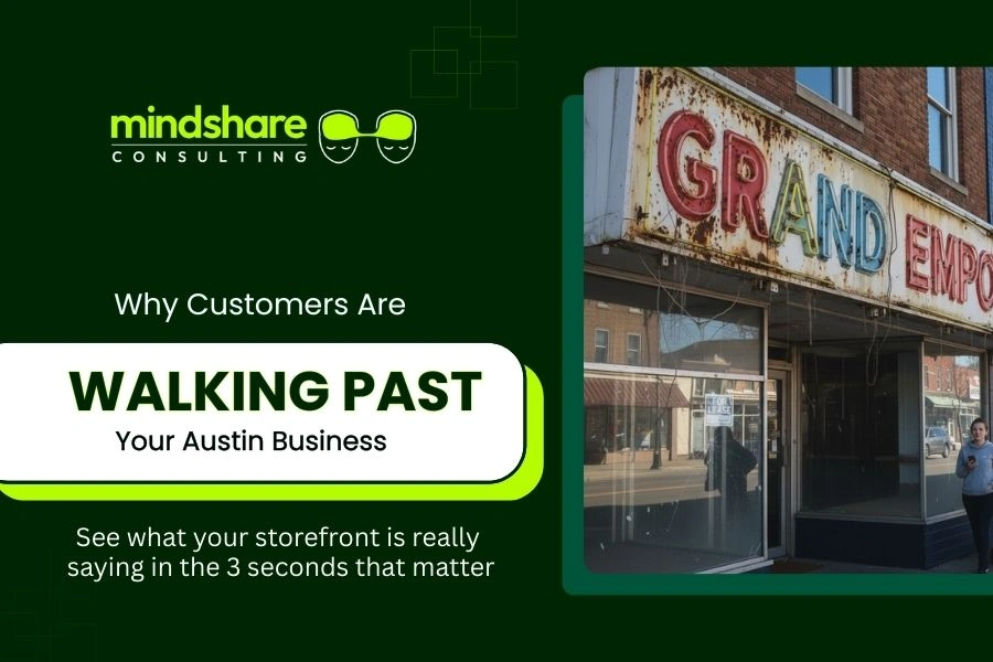
Austin’s busiest areas, Downtown, South Congress, East Side, Lamar, Parmer, and mixed-use centers, are packed with signs, lights, and competing visuals. More people on the street do not automatically mean more customers; it only helps the businesses that stand out and signal “We’re open, and here’s what we offer.” In many of these districts, event calendars and tourism guides highlight constant activity, so standing out visually on the street is critical.
In many cases, the problem isn’t your product, service, or reviews, it’s your visibility and presentation. Exterior signage, lighting, windows, and interior layout all combine to answer (or fail to answer) a simple question for passersby: “What is this place, and should I go in?” Well-planned storefront signage is a core part of local marketing for brick-and-mortar businesses.
Reason #1: Your Exterior Sign Is Hard to See
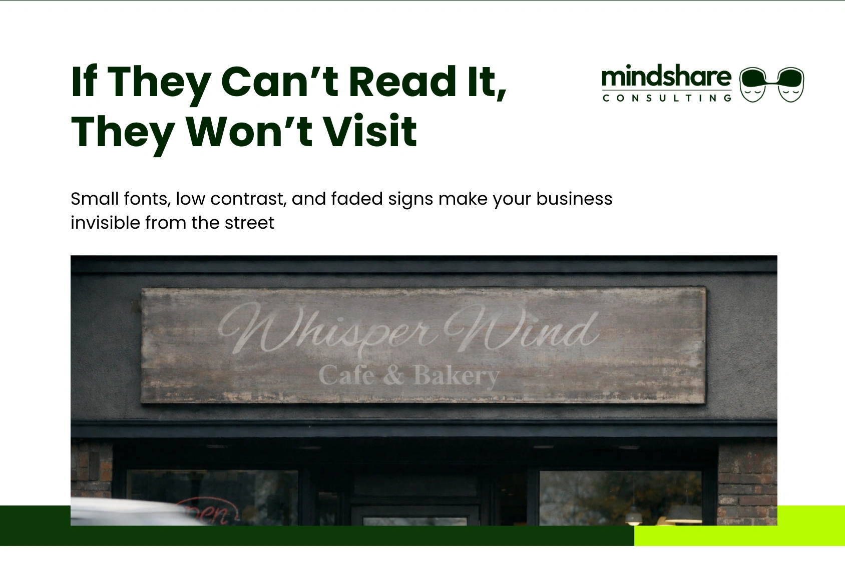
Your main building sign should act like an anchor for your location. When it’s hard to see, everything else struggles.
Common problems:
- Fonts that are too small, thin, or decorative to read from across the street or at driving speed.
- Low contrast between letters and the building background (e.g., dark letters on a dark wall).
- Faded, old, or off‑brand signs that blend into their surroundings.
This affects both people passing by and those following GPS directions. Someone might be looking right at your building while driving or walking and still not spot you quickly enough, especially in high‑traffic corridors.
What to do:
- Increase letter height and choose bolder, cleaner fonts.
- Ensure strong color contrast between text and background.
- Refresh or replace faded and outdated signs so your brand stands out instead of disappearing.
You can find more information about business sign options on the Austin Sign Masters.
Reason #2: Poor Lighting Makes You Look Closed
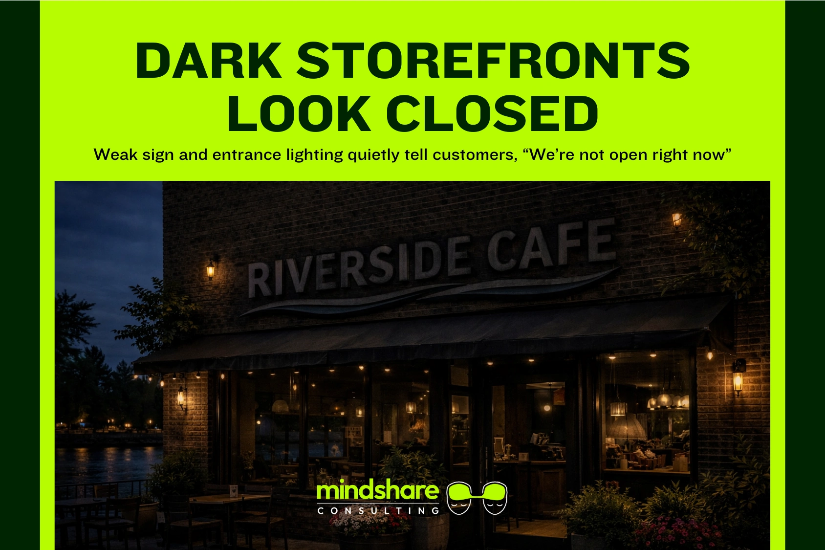
Lighting is one of the biggest reasons customers assume a business is closed when it isn’t.
Typical issues:
- No illumination on the sign, so your name disappears at dusk and at night.
- Dim or uneven lighting at the entrance, making the storefront feel inactive or uninviting.
- Interior lights turned down too low near windows, so the space looks empty even during business hours.
In busy urban environments, research and case studies on physical retail show that bright, consistent exterior lighting improves perceived safety and openness, which increases the likelihood that passersby will enter.
What to do:
- Add or upgrade LED lighting to your exterior sign so it stays legible in all conditions. LED systems are now standard for energy‑efficient, long‑life sign illumination.
- Improve doorway lighting, warm, bright light around the entrance signals “open and active.”
- Keep interior lighting near windows bright enough that the business looks alive from the street.
A professional sign company can specify LED systems and installation methods that work for Austin’s climate and energy considerations; see how Austin Sign Masters talks about long‑term performance and local conditions.
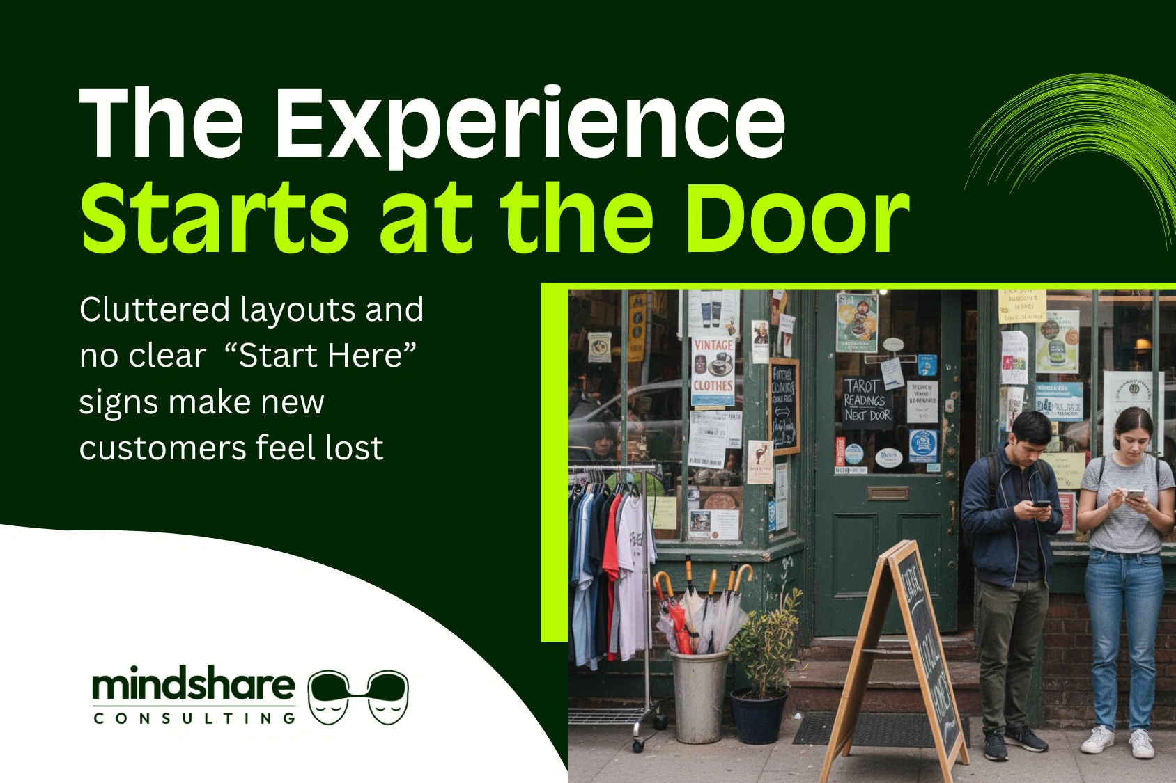
Reason #3: Confusing or Hidden Entrances
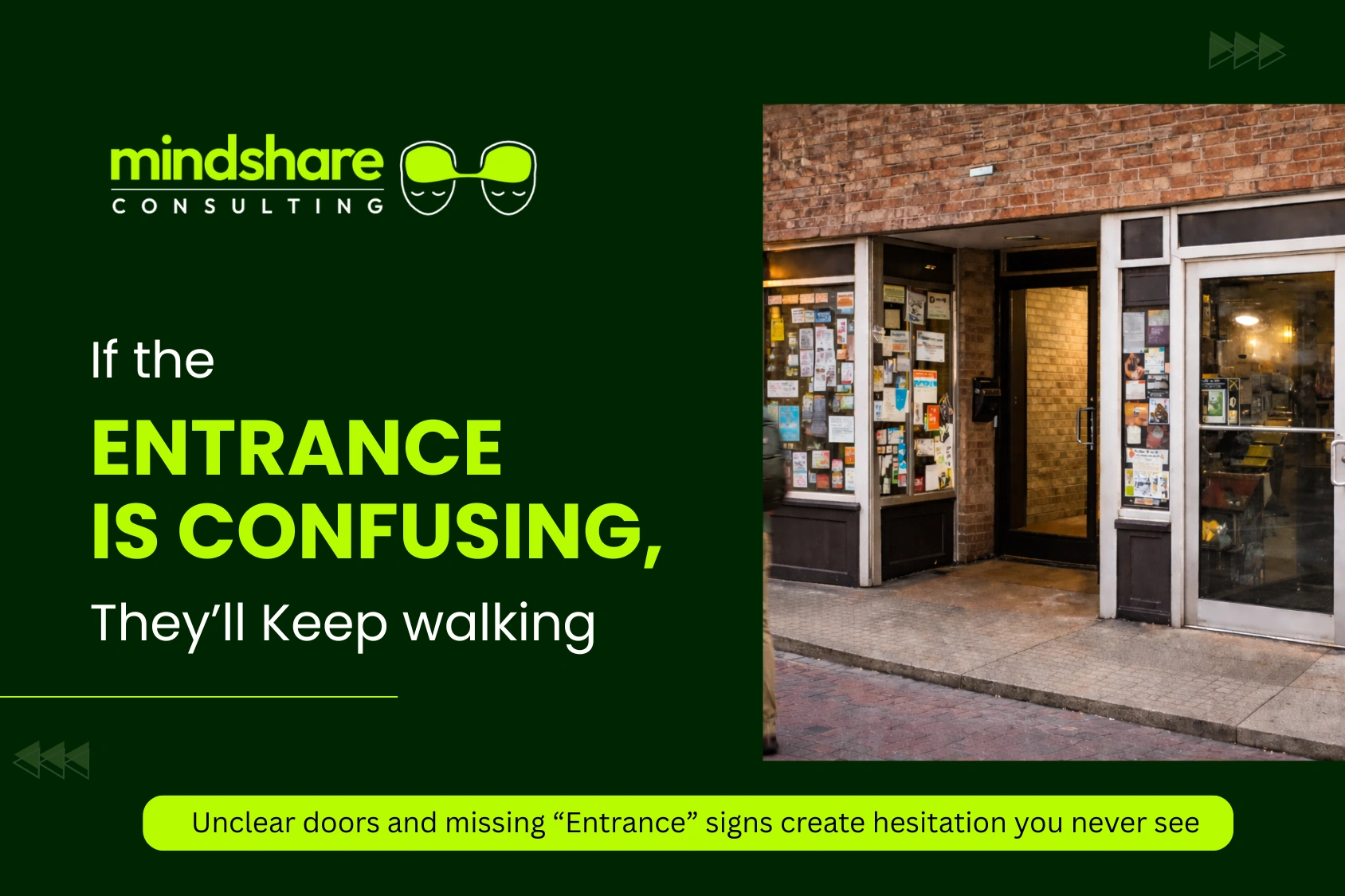
If people can’t quickly figure out how to get inside, many won’t bother.
Common problems:
- The door is recessed, on the side, or shared with other tenants, and not clearly marked.
- No clear “Entrance,” “Open,” or directional signage pointing people in.
- Windows and doors cluttered with stickers, posters, or blinds that hide where to go.
Even a great storefront can lose customers if the entry feels confusing or awkward; wayfinding and environmental design research indicates that clear directional cues significantly reduce hesitation and drop‑offs at entrances.
What to do:
- Add simple directional signage (“Entrance →”, “Main Entrance Around Corner”).
- Use door graphics that clearly show your name, hours, and an “Open” indicator.
- Reduce clutter on doors and windows right around the entrance so the path is obvious.
These elements are typically created as part of an exterior signage and window graphics package; see examples of such work on the Austin Sign Masters signage services page.
Reason #4: Windows That Don’t Tell a Story (or Tell the Wrong One)
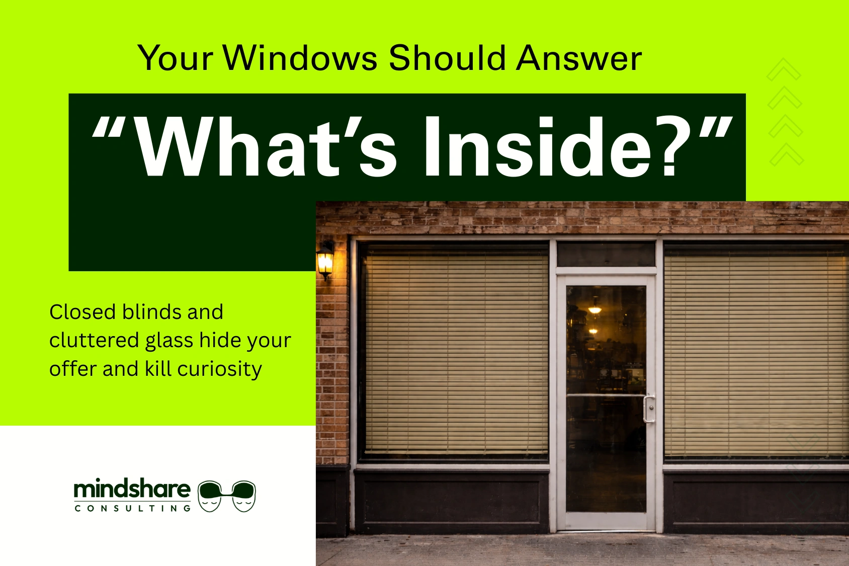
Your windows are prime real estate for telling passing customers what kind of experience they can expect.
Problems that push people away:
- Blinds closed or heavily tinted windows that hide what’s inside, making you look closed or unwelcoming.
- Over‑cluttered windows covered in unrelated posters, flyers, or taped signs.
- No clear view of products, menu, or atmosphere to hook interest.
Retail and hospitality guidance consistently recommends using window displays and graphics to communicate your core offer and brand personality quickly, because most passersby decide in a few seconds whether a storefront is relevant to them.
What to do:
- Use window graphics and decals that highlight your core offer (“Coffee &; Breakfast,” “Local Gifts,” “Same‑Day Repairs”).
- Create curated displays that show your best products or give a glimpse of the vibe inside.
- Avoid blocking all visibility; let people see life, light, and activity.
Window graphics and interior‑facing signs are part of what Austin Sign Masters provides for businesses that need both privacy and visibility.
Reason #5: No Clear Message at Street Level
![]()
A lot of businesses only show their logo or name and forget to say what they actually do.
Problems:
- Storefront only shows the business name, so new people can’t tell if you’re a café, salon, shop, or office.
- No call‑to‑action or explanation of your main attraction, no “Coffee & Pastries,” “Urgent Care,” “Tax & Accounting,” or “Local Gifts.”
- No sidewalk or A‑frame sign to catch attention where people actually walk.
On busy streets, clarity and category cues are crucial; wayfinding and shopper behavior research notes that descriptive signage can significantly increase recognition and spontaneous visits.
What to do:
- Add a short descriptor line under or near your name (e.g., “Craft Coffee & Breakfast,” “Family Dental,” “Vintage & Local Gifts”).
- Use a sidewalk/A‑frame sign with a big, simple message and an arrow if needed.
- Keep text short and bold so it can be read in 2–3 seconds.
Sidewalk signs, A‑frames, and supplemental panels are standard tools in storefront sign packages like those offered by Austin Sign Masters.
Reason #6: Interior Layout That Pushes People Away
Visibility isn’t just outside. The inside needs to “make sense” immediately when someone steps in.
Common issues:
- First impression is clutter, confusion, or a big empty space with no visual focal point.
- No clear path from entrance to counter, seating, or main service area.
- Important zones like menu, checkout, or best‑selling products are hidden from the door.
Retail and restaurant design best practices emphasize intuitive circulation and clear focal points to reduce confusion and increase time spent in the space.
What to do:
- Use interior signage to guide the journey: “Order Here,” “Start Here,” “Check‑In,” “Restrooms.”
- Place menus or key information where they’re visible from the entrance.
- Create focal displays so there’s something attractive and obvious to look at right away.
Interior signs, menu boards, and wayfinding elements are often handled alongside exterior work by full‑service sign companies; you can see how Austin Sign Masters positions itself as a partner for both interior and exterior visibility.
Quick Self‑Audit: See Your Business the Way Customers Do
You can’t fix what you don’t see. Run a simple, honest visibility audit:
- Step across the street.
Can you read your name and understand what you do in under 3 seconds? - Walk past at normal speed.
Does anything, sign, window, lighting, make you slow down or look again? - Check at dusk and after dark.
Does your business still look clearly open, active, and safe? - Step inside as if for the first time.
Is it obvious where to go, who to talk to, or how to get service? - Ask someone you trust.
Invite a friend, regular customer, or another business owner to give you honest first‑impression feedback.
Visibility audits like this align with broader local marketing guidance: optimizing your physical presence often provides better ROI than simply increasing ad spend to drive more people to an underperforming storefront.
Practical Fixes: High‑Impact Changes That Make You Noticeable
You don’t always need a full renovation. Start with the elements that most affect visibility and clarity.
External Fixes
- Larger, clearer building sign with strong contrast and readable fonts.
- LED lighting for your sign and entrance to keep you visible and inviting after dark.
- Window graphics that highlight what you offer and let people see life inside.
- Sidewalk/A‑frame sign with one clear message and an arrow when needed.
Internal Fixes
- Improve “open visibility” from the door: brighter lighting, a visible menu or service list, and a focal display.
- Add directional signs like “Order Here,” “Start Here,” “Check‑In,” “Restrooms,” and “Exit” where needed.
- Remove or reorganize clutter near the entrance so the first impression feels intentional, not chaotic.
A coordinated approach, building sign, windows, lighting, sidewalk signs, and interior wayfinding, is exactly what companies like Austin Sign Masters are set up to deliver for local businesses.
Why This Blog Matters for You
If you’re in Austin, you’ve already invested in rent, build‑out, staffing, and marketing just to be where your customers are. Visibility problems mean you’re invisible to the very people you’ve already paid to be near.
Fixing visibility:
- Often costs less than relocating to a “better” spot.
- Can cost less than ongoing ad spend that sends people to a storefront that still doesn’t convert.
- Pays off every day as more people notice you, understand you, and feel confident walking in.
This blog exists to help you see the issues you might be blind to because you walk past them every day. Small, targeted changes to signage, lighting, and layout can turn “Why is it so slow?” into “We’re finally getting the kind of walk‑in traffic we should.”
If you want to understand how a local signage partner approaches these problems, you can learn more on the About Austin Sign Masters page.
If customers can’t see you or understand you in a few seconds, they choose someone else, often right next door. You might think you have a location problem or a marketing problem, when in reality you have a visibility problem you can actually fix.
You don’t have to accept “slow days” as your new normal.
Wondering if customers are walking past your Austin business for all the wrong reasons? Request a quick visibility and signage review from Austin Sign Masters and get a clear, prioritized list of what to fix first so more people notice you, walk in, and come back.